
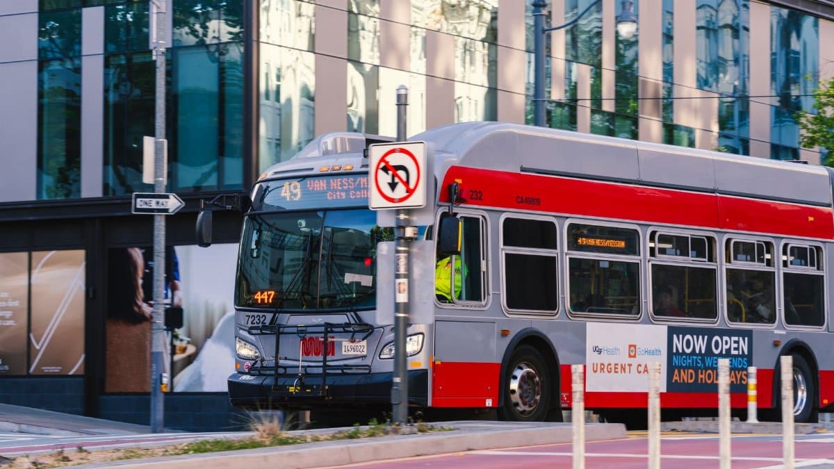
The story of public transit symbols in American cities often mirrors changing tastes in design and civic pride. When a leading branding expert unveiled a sleek new mark for San Francisco buses and streetcars in the middle of the 1970s the response from locals proved sharply divided. Decades on that same mark stands as a point of affection and a shorthand for the city itself. The Muni logo history offers a window into how patience and repeated exposure can transform an object of debate into an emblem of place.
Initial Public Response in the Seventies

Critics at the time described the flowing script as too abstract and hard to read on moving vehicles. Letters to editors questioned the choice of a lowercase style that seemed more suited to advertising than to a public agency. Riders worried that quick glances at maps would become confusing during daily commutes across steep hills and busy avenues.
Walter Landor Approach to Transit Marks
The designer built his career on clean lines that could work at small sizes on packaging and large scales on buildings. His studio tested the Muni mark on actual bus panels to judge visibility from a distance. Early sketches explored several scripts before settling on the one that suggested motion without literal wheels or tracks.
Shift in Perception Over Five Decades

By the nineteen nineties the same design began appearing on merchandise sold in tourist shops. Local artists incorporated the script into murals and posters that celebrated neighborhood life. What once drew complaints now signaled authenticity in a city known for its independent spirit.
Role in Daily City Life

Today the mark guides passengers at underground stations and on overhead wires. It appears on fare cards and digital apps that help people plan routes through fog and traffic. Its presence on the sides of historic streetcars reminds riders of continuity amid constant urban change.
Comparisons With Other City Symbols

Unlike more literal crests used by transit systems elsewhere this script relies on simplicity. It avoids imagery of bridges or water and instead lets the name itself carry the identity. That restraint has allowed it to remain fresh even as fashion in graphic design has moved through several cycles.
Influence on Local Artists and Makers

Painters and printmakers have reproduced the script in limited editions that sell at weekend markets. Fashion labels print it on shirts and hats aimed at residents rather than visitors. Such adaptations show how an official mark can migrate into unofficial expressions of belonging.
Challenges of Updating an Established Mark

Agency staff have considered minor adjustments for accessibility standards yet public attachment has kept alterations minimal. Focus groups revealed strong resistance to any version that changed the original flow. The result has been a policy of preservation rather than overhaul.
Place in San Francisco Memory

Older residents recall first seeing the mark on new buses rolling down Market Street. Younger ones encounter it as a constant backdrop to their routines. Across generations it functions less as a logo and more as a quiet marker of home.
Future Prospects for the Symbol

With new transit projects underway the mark will likely continue on vehicles and signage for years ahead. Its endurance suggests that successful civic design rewards consistency over novelty. In this sense the Muni logo history stands as evidence that time can confer value on even the most debated creations.