Imagine walking into an open-plan office on a dreary winter morning, only to be greeted by walls painted in warm, golden tones reminiscent of a summer sunset. The shift in atmosphere is palpable—shoulders relax, conversations spark, and the day feels a little less heavy. This isn’t just whimsy. The concept of office color mood, or how color palettes influence workplace morale, has gained traction among designers and HR managers alike. As companies rethink employee well-being in 2025, something as simple as a seasonal paint refresh could be a quiet game-changer. Studies suggest color impacts mood and productivity more than we often acknowledge. So, could rotating hues with the calendar—think soft greens for spring, deep blues for winter—offer a practical lift to team spirit in sprawling, shared workspaces? Let’s unpack the science, the trends, and the real-world effects behind this idea.
The Psychology Behind Color and Mood

Colors aren’t just visual. They carry emotional weight. Red can spike energy or anxiety, while blue often calms the mind. Research from the University of Texas found that color in environments like offices can influence stress levels and focus, with cooler tones generally promoting relaxation. You can explore their findings on environmental psychology University of Texas Research Page. In open-plan offices, where personal space is limited, these effects amplify. A harsh, sterile white might feel clinical, draining enthusiasm over time. Conversely, a thoughtfully chosen palette can signal care, subtly nudging employees toward a shared sense of purpose. It’s not about tricking anyone—it’s about crafting a space that feels less like a machine and more like a community.
Think of a tech startup in Seattle, where gray skies dominate for months. A manager there swapped out cold, neutral tones for earthy terracotta accents one winter. Workers noticed. One remarked anonymously in a team survey that the change made Monday mornings “less of a slog.” Small shifts, big ripples. The right office color mood can act as an unspoken motivator, especially in environments where collaboration is key.
Seasonal Palettes: A Natural Rhythm for Workspaces

Why tie colors to seasons? Humans are wired to respond to nature’s cycles. Spring’s renewal, summer’s vibrancy, fall’s warmth, winter’s introspection—these aren’t just poetic ideas but psychological cues. A study by the National Institutes of Health highlights how seasonal changes affect mood and energy, a phenomenon that could extend to workplace design. See more on their research into seasonal affective disorder at NIMH Seasonal Affective Disorder Page. Painting office walls with pastel greens in April or amber tones in October might tap into those innate rhythms, offering a subconscious reset as the months turn.
In practice, this doesn’t mean a full repaint every quarter. Accent walls, movable partitions, or even seasonal decor like cushions and art can do the trick. It’s less about expense and more about intention. When the environment mirrors the world outside, employees often feel more grounded, less disconnected from the natural ebb and flow. Open-plan offices, with their vast shared spaces, stand to gain the most from these periodic updates, as there’s nowhere to hide from a dreary or uninspired aesthetic.
Boosting Morale in Open-Plan Challenges

Open-plan offices are a double-edged sword. They foster collaboration but strip away privacy. Noise, distractions, and a sense of exposure can erode morale over time. Color becomes a quiet ally here. A 2019 report from the American Psychological Association noted that environmental factors, including color, play a measurable role in workplace satisfaction. Dig into their insights on workplace well-being at APA Workplace Topics. Soft, muted tones can visually “soften” a cavernous space, reducing the feeling of being lost in a crowd. Warmer seasonal shades, like burnt orange in autumn, can create pockets of coziness amid the chaos.
Contrast this with the alternative: endless beige or gray that feels more like a warehouse than a workspace. Employees in such settings often report feeling like cogs, not contributors. A seasonal color shift, even if subtle, signals that someone’s paying attention to their experience. It’s a small gesture with outsized potential to counter the impersonality of open layouts.
Productivity Gains: What the Data Says

Does office color mood actually translate to better work? Evidence leans toward yes. A study published through the University of British Columbia found that employees in environments with intentional color design reported higher engagement and lower fatigue. Check their research on workplace environments at UBC Research Page. Seasonal palettes may enhance this by preventing monotony—when the scenery changes, so does the mental frame. Imagine a winter palette of deep navy and silver, evoking quiet focus, giving way to lively coral in summer, sparking energy for brainstorming sessions.
This isn’t just theory. A mid-sized accounting firm in Chicago tested quarterly color updates in 2024, using portable panels to shift hues. Team leads reported a 10% uptick in meeting participation over six months. Numbers like these suggest that while color isn’t a cure-all, it’s a tool worth considering. In open-plan setups, where energy can stagnate, these shifts might keep the vibe fresh without major overhauls.
Practical Tips for Implementation

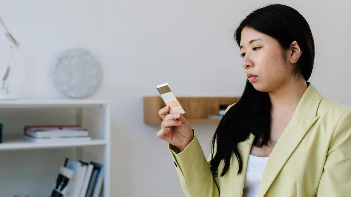
Ready to experiment with seasonal office color mood? Start small. Focus on high-impact areas like break rooms or central walls visible to most staff. Spring could mean light mint or lavender—calming yet hopeful. Summer might call for sunny yellows or aqua, energizing without overwhelming. Fall suits rust or olive tones, grounding teams as days shorten. Winter’s deep teal or burgundy can feel cozy, combating seasonal blues. Don’t overdo it; too much color can distract. Balance with neutrals to keep the space professional.
Budget matters. Paint is cheap, but time isn’t. Consider temporary solutions like vinyl decals or fabric panels that can be swapped out. Involve the team—survey preferences or let departments vote on a shade. Ownership breeds buy-in. Finally, track the impact. Are people lingering in common areas more? Do mood check-ins show a lift? Data will tell you if the effort sticks.
Navigating Pushback and Skepticism

Not everyone’s sold on office color mood as a morale booster. Some managers see it as frivolous, a distraction from “real” issues like workload or pay. Others worry about clashing tastes—what’s soothing to one person might grate on another. These concerns aren’t baseless. A poorly chosen palette, like an aggressive red in a high-stress quarter, could backfire, heightening tension instead of easing it. And in diverse teams, cultural associations with color vary widely; purple might signal royalty to some and mourning to others.
Yet, dismissal overlooks the broader trend. Employee well-being is no longer a nice-to-have—it’s a retention factor. Addressing skeptics means starting with evidence, like the studies cited earlier, and emphasizing low-cost trials. One recent account shared online captured the flip side: an employee described feeling “seen” when their office added seasonal touches, a rare bright spot in a grinding year. Small wins can shift perspectives, even among the doubtful.
Looking Ahead: A Colorful Workplace Evolution

As workplaces evolve in 2025, the conversation around office color mood feels timely. Hybrid models and mental health initiatives are already reshaping how we think about office design. Seasonal palettes could dovetail with these shifts, offering a low-stakes way to signal adaptability. Picture a future where color schedules are as routine as holiday decor, each quarter bringing a fresh lens to shared spaces. Open-plan offices, often criticized for their soulless sprawl, might find a new warmth in this approach.
The idea isn’t to overpromise. Color won’t fix systemic issues or replace meaningful dialogue. But in a world where burnout looms large, it’s a tangible step. It reminds us that environment matters—that a splash of spring green or winter plum can cut through the monotony. For middle-aged workers juggling deadlines and life outside the office, these small nods to humanity might just make the daily grind a bit more bearable.
