
On a warm afternoon in a corner grocery near the Great Highway, a shopper reached for the familiar round sandwich and paused. The cookie looked the same. The wrapper carried the same hometown pride. The filling, though, had lost the electric green that once announced mint from across the freezer case. That small visual shift is the Its-It mint dye change, a quiet reformulation that says as much about regulation and memory as it does about ice cream.
A color that trained the eye

For decades, mint ice cream in American freezers has been a lesson in expectation. Shoppers learned to trust a bright green as proof of flavor, even when the taste came from extract and the hue came from a laboratory. The San Francisco sandwich maker built its mint version inside that visual contract. Oatmeal cookies framed a filling that read, at a glance, as cool, sweet, and unmistakably mint.
Color does work that words on a label cannot. It sorts a crowded case in a second. It tells a child which sandwich is mint and which is vanilla. It also flatters memory. People who grew up with neon mint often describe the shade as part of the pleasure, not a costume laid over it. When that shade disappears, the product can taste identical and still feel unfamiliar.
What the company actually stopped using

According to reporting in the San Francisco Chronicle, the company removed the synthetic coloring that had kept its mint filling vividly green. The dye in question is Blue No. 1, a widely used certified color that, in combination with other ingredients, helps produce that familiar mint cast. The Chronicle account is here: Its It mint ice cream and the dye decision.
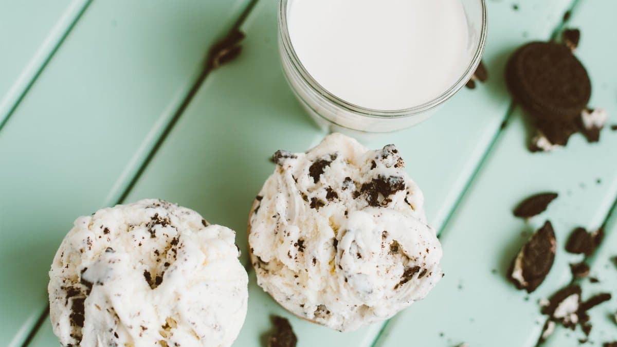
The change is not a new flavor and not a new cookie. It is a decision about appearance. Without Blue No. 1, mint ice cream tends toward cream, ivory, or a faint natural tint, depending on the extract and the dairy. The sandwich still carries mint. It simply refuses to shout the flavor in fluorescent green.
That distinction matters. A dye removal can be marketed as purity, or it can be described plainly as a response to federal guidance. The more honest frame is the second. The company did not discover that mint is white. It chose to stop painting it.
Federal guidance, not a midnight ban

The backdrop is a broader federal push to move petroleum based synthetic dyes out of the food supply. Health officials have urged companies to phase out several certified colors and have pointed families toward products that rely on other coloring methods, or on no added color at all. Guidance is not the same thing as a statute that empties shelves overnight. It is pressure, public and practical, and large brands have been reading it.
Blue No. 1 has a long record of approved use in candies, drinks, and frozen desserts. Critics argue that synthetic dyes add no nutrition and that some children show behavioral sensitivity. Defenders note that certified colors are tightly specified and that dose and diet matter more than a single sandwich. A news story does not need to settle that scientific argument to describe what a company did next.
What it does need is proportion. One regional ice cream sandwich will not rewrite American nutrition. It can, however, show how guidance travels from a press conference into a formula, then into a freezer, then into a moment of mild confusion at the checkout.
Why mint was the obvious candidate
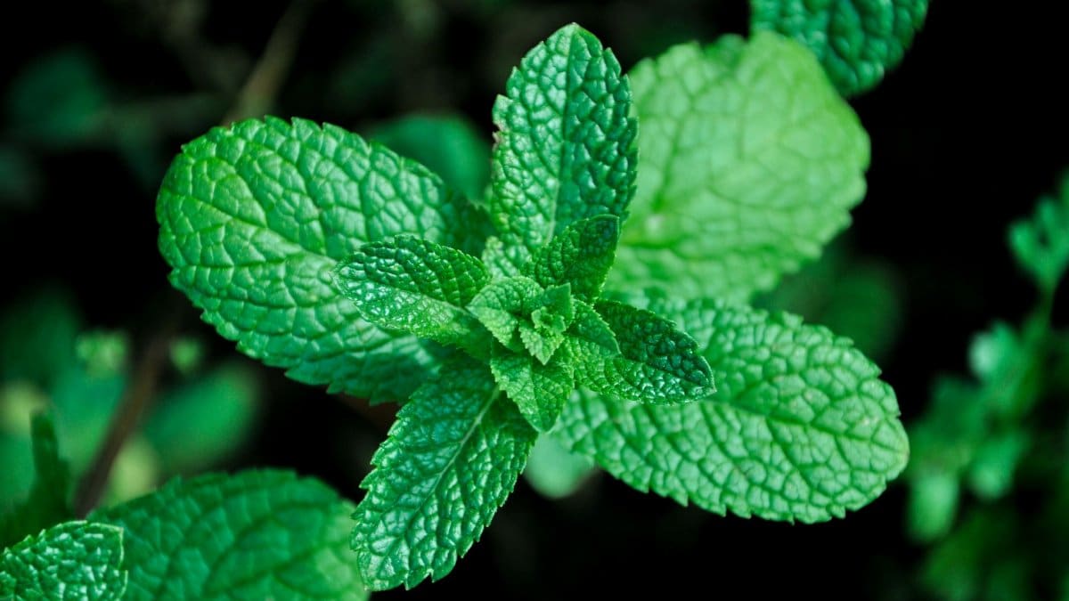
Vanilla does not depend on dye to explain itself. Chocolate has its own dark evidence. Mint, in the industrial imagination, has often been a flavored white base wearing a green costume. That makes it an easy place to start a reformulation. Remove the costume and the product still has a name, a scent, and a cool finish on the tongue.
Other flavors hide dye more cleverly. A berry swirl can look plausible with fruit concentrate. A mint filling that has been bright green for years has nowhere to hide the absence. The Its-It mint dye change is visible in a way a tweak to a chocolate chip cookie would not be. Visibility is the point, and also the risk. Loyal buyers may read the paler filling as weaker, cheaper, or mistakenly vanilla.
Companies that have walked this path usually answer with tasting, not with lectures. If the mint is still mint, repetition does the teaching. The first sandwich surprises. The third one resets the eye.
How a filling looks when the paint comes off

Natural mint extract is not a pigment in the way spinach juice or matcha can be. It is an aroma and a flavor, potent in small amounts, pale in the bowl. Dairy proteins and milk fat scatter light and push the mixture toward white. Cookie crumbs stirred through a sandwich filling add speckles, not a wash of green. The result, in most dye free mint formulas, is closer to a vanilla that has been perfumed than to the lawn colored slabs of old drugstore nostalgia.
Some makers compensate with spirulina extract, chlorophyll, or other plant colors. Those ingredients bring their own costs, stability questions, and flavor risks. Heat, light, and months in a warehouse can dull them. A company that simply drops Blue No. 1 and accepts a paler filling is choosing simplicity over a replacement costume. That choice is legible. It also avoids swapping one coloring system for another that shoppers may not understand any better.
The sandwich as a local habit
The brand began as a San Francisco pleasure, tied to the old beach amusement grounds and to a cookie that could survive a foggy afternoon in a paper sleeve. Generations have treated the round sandwich as civic equipment: a reward after a game, a freezer staple, a gift tucked into a cooler for a drive down the Peninsula. Local foods gather meaning that outruns their ingredient list. People defend them the way they defend a park bench or a bus line.
Color sits inside that meaning. A paler mint can feel, to some, like a small erosion of childhood, even when the cookie recipe is untouched. To others it feels like honesty. Both reactions are about trust. Trust, in a food people have eaten since they were small, is not only a matter of safety data. It is a matter of whether the thing in the hand still matches the picture in the head.
I have watched that mismatch play out with other reformed classics, from sodas that lost a dye to cereals that dulled their bowls. The complaint is rarely chemical. It is aesthetic, and aesthetics are how many of us decide what is still ours.
What shoppers can check on the carton

The practical question is simpler than the nostalgia. Read the ingredient line. If Blue No. 1 is gone from the mint filling, the label should say so by absence. Mint extract, cream or milk ingredients, sugar, and the cookie components will carry the explanation of flavor. A company that wants goodwill will also say, in plain language near the flavor name, that the color has changed and the taste has not.
Freezer lighting flatters and betrays. Under harsh retail lamps, a naturally pale filling can look gray. At home, in daylight, it often looks simply like ice cream. Anyone comparing an old memory with a new sandwich should taste before judging the photograph in the mind. Mint announces itself in the nose first. If that perfume is intact, the missing green is a costume change, not a recasting.
A wider shelf moving in the same direction

Ice cream is only one aisle. Beverage companies, candy makers, and school meal suppliers have been rewriting color formulas under the same federal encouragement. Some will swap in plant extracts. Some will drop color and bet that flavor names are enough. Retailers may follow with house brands, because a private label that still glows while the name brand goes pale starts to look behind the times.
None of this requires a spiritual reading of groceries, though the category of trend watching sometimes reaches for one. What is real is ritual. Families have small liturgies of snacks, repeated without sermon. When a ritual object changes color, people notice, talk, and either adapt or hunt for the old version online. That chatter is the market research no focus group quite replaces.
The Its-It mint dye change belongs to that chatter. It is local enough to feel personal in the Bay Area and ordinary enough to preview what other mint products may do when their turn comes.
Taste, texture, and the limits of a dye story
Removing a color additive does not automatically improve texture, sugar balance, or the snap of an oatmeal cookie. It does not lower calories in any meaningful way. Shoppers who want a lighter dessert still have to read the nutrition panel. Shoppers who want a cleaner ingredient list get a shorter one, which is a real, if modest, gain.
There is also a limit to what reporters can claim about health. A single certified dye, used within allowed amounts, is not a verdict on a person’s diet. Public health arguments about synthetic colors concern cumulative exposure, child directed marketing, and whether color is doing promotional work that food does not need. Those are fair questions for regulators and parents. They are not a reason to treat a paler ice cream sandwich as medicine.
The honest consumer note is narrower. If you liked the mint, taste the new batch. If you bought the green as a signal for someone else in the house, tell them the signal moved. If you are comparing brands, compare ingredient lists rather than the glow under freezer glass.
Memory, marketing, and the next batch
Marketing departments prefer a hero narrative: a beloved company hears the public and bravely strips out a chemical. Procurement departments prefer a calendar: guidance arrives, suppliers confirm alternatives, a formula is locked, old packaging runs out. Both can be true. The sandwich that lands in a cart is the end of a supply chain, not a moral fable.
Still, the fable will be told, because color is a story people can see. Social feeds will hold up the old green beside the new cream and ask which one is real mint. The answer is that both can be mint, and only one of them was dyed to match a twentieth century idea of what mint should look like. That idea was successful. It sold a great many sandwiches. It is no longer the only idea available to a company that wants to stay on the right side of federal advice and of a public newly attentive to labels.
Production details will matter in the months ahead. If the paler filling softens the cookie differently, or if extract levels are adjusted to compensate for the missing visual punch, tasters will notice before any press release admits it. Quality is a sequence of batches, not a single announcement. The Chronicle report captures the decision. The freezer will capture whether the decision holds.
A small change with a long aftertaste

Food history is full of colors we later found strange: butter dyed to look like summer grass, oranges painted to look ripe, mint dressed as a cartoon of itself. Each correction feels abrupt to the people who loved the old picture, and obvious to the people who come after. The Its-It mint dye change is one correction among many, scaled to a regional classic rather than a global soda brand. Its modesty is what makes it useful to watch.
Nothing in the cookie requires a sermon. A city that has always taken its ice cream personally can take this personally too, then move on to the next foggy afternoon. The filling will be paler. The mint, if the extract is honest and the dairy is sound, will still cool the mouth. Federal guidance will keep pressing other dyes toward the exit. Shoppers will keep using color as a shortcut until the shortcut stops working.
When it stops, they do what they have always done with a familiar sandwich. They open the wrapper. They trust the first bite more than the memory of a color. And they decide, without a focus group, whether the thing they loved was the green, or the mint, or the simple fact that it was theirs.